Work.
If you love what you do
you’ll never work a day in your life.
Believe it or not… I created this page for those in a hurry. I call this the long shot. Just keep scrolling down for my work examples, all on one page.
If you prefer a little more order and time to select based on preference, then best to click here >

Partofthe.team
Creative Direction, Brand Identity/Strategy and Design

I'm really happy I can now show this project... it's the brand identity and concept for Jane Hales, CMRS and for the Part of the .team offering which I've recently completed – which is an MRX support staffing solution, ideal for Market Research Agencies, Internal Insight Teams and Independent Research Consultants.
Rationale behind the logo: I wanted to create a device that was very simplistic but had meaning, something that expressed individuals as well as a group / divided yet together as a whole / as well as multiple tasks and processes as single elements of that whole. There are seven elements for 7 days in a week, which is when the services can be utilised collectively or separately. It also has that data or bar chart feel which is intentional as a measurer of data, levels and processes. The centre piece has an outline and this is where your Part of the .team come in. They are the virtual element and exist in another place so have the border surrounding, however they fit and hold a prominent position within the group. I see this as someone who is a part of the whole and part of the team.
I look forward to progressing the brand with, creative, design and messaging with the client as they grow and wish them every success with it. Knowing Jane, that will never be down to a lack of effort and or ability. It's a great idea.
If I can help you with brand, design, creative or concepts on any marketing, advertising or communications projects then please DM me and let's chat.


Justin Robert Price
creative. design. thinking.
STEAMhouse/Birmingham City University
Creative Direction, Campaign Concepts and Design

I was approached by Birmingham City University in approx 2018 to work on a small brief for STEAMhouse – which is a specialist niche maker space. After helping to push their brand styling further on some successful projects, I’ve supported them ever since on a plethora of varied design and creative projects offering conceptual solutions and creative.
STEAMhouse has grown a great deal from those early years and projects and moved to a larger site (which is housed in the outers of an old bicycle factory – a stunning development). This site will help transform the lives of their students and citizens within the region utilising its centre for collaboration and innovation. It’s a great place with a varied array of skills and equipment on tap and a melting pot where Science / Technology / Engineering and Maths meet with the creativity of the Arts. A very unique place indeed and in the heart of Birmingham. Being a part of this and being inspired to spread the word in varying ways and mediums has been a big love for me over the past 5 years, guiding, and working with multiple key members, leaders and staff within the organisation. To think all that has been created from that first project is unreal but using the existing logo and a typeface with some thought… A great deal has been done and achieved.
It’s been an enjoyable project to work on allowing me opportunities to push the existing shapes and colours in differing ways to create some new forms, as well as set up a bank of assets for some ops and guides for ways forward internally. One thing I’ve always been fervent about – was to kept the layout and typography clean. Utilising plenty of white space where I could and balancing the visual of the shapes with that of the photography and line work / colours, copy and imagery, which were selected and created to show the brand and user audience to the best of it’s ability.
The work has been very well received – and STEAMhouse continue to grow from strength-to-strength.


Justin Robert Price
creative. design. thinking.
XL: 40 Years of the Super Bowl – The Opus
Creative Direction and Design

This is one of my older projects shown but one I still love and have great fondness for to this very day.
I was selected to work as a Designer on a title called XL SuperBowl The Opus in 2007 as part of the team at Kraken Creative in Coventry, as one of the team assisting the lead designer over a seven month period. There was a specialist team of four working on this publication, backed by editors and picture researchers in both the U.S and U.K.
The project was in conjunction with the National Football League in the U.S.A, and was colossal in every sense of the word. Weighing over 30 kgs, with over 800 pages and with a one metre width per page spread, this was a very large book.
The publication was classed as a luxury art book retailing at $4,000 per copy and $40,000 per copy for the Special MVP Edition. The print run was limited so it would never be created in any other format and thus be more collectable in time.
We crafted the history and the story of this majestic event with carefully considered typography and layout. Using masses of unseen photography from some of the greatest sports photographers and content from specialist writers all dedicated to the story telling and the history of the event. A select number of copies were signed by American Footballers, SuperBowl MVP's and Hall of Famers. All-in-all it was a fantastic dream project to have been involved in.


Justin Robert Price
creative. design. thinking.
Fortinet Cybersecurity Skills Gap Report – for Sapio Research
Creative Direction and Design

I was chosen to create several reports for SAPIO Research in London for their own end international clients. Two of these reports were created for US cybersecurity specialist – Fortinet. Working and liaising with the SAPIO team and project managers I helped to shape the format to something that Fortinet’s internal brand and project team were very happy with and we really helped to bring the data and foundation of the report to life.
Important to mention, the organisation had a detailed set of guidelines and some lovely assets to utilise and with good comms and keeping on top of requests and deadlines we got these reports finished on and before time for the client and ready for their respective launches.
I’ve got some great experience creating reports for clients. Sadly, a great deal I can’t show due to various agreements and NDAs but if you have something of interest you’d like to talk about… Please DM me and let’s talk.


Justin Robert Price
creative. design. thinking.
Rugby Schools Group
Creative Direction and Design

Shown is a small creative and design project undertaken for the Rugby Schools Group. Now, there are not many schools that can claim to be as prestigious and as well known, I mean let’s be honest they invented a game ;) So I was delighted when a trusted connection chose to put me forward due to my many projects over the years in the education sector, to support the group on this project.
It was a simple project clean and modern in design but with that edge towards sophistication, to highlight the outstanding teaching and a snippet about the organisation to new interested parties in what is ‘Fast becoming a Global Educator’, they’re not my words – but those of Tatler.
Great history and tradition. Long may they continue to inspire youth and the next generation.

Justin Robert Price
creative. design. thinking.
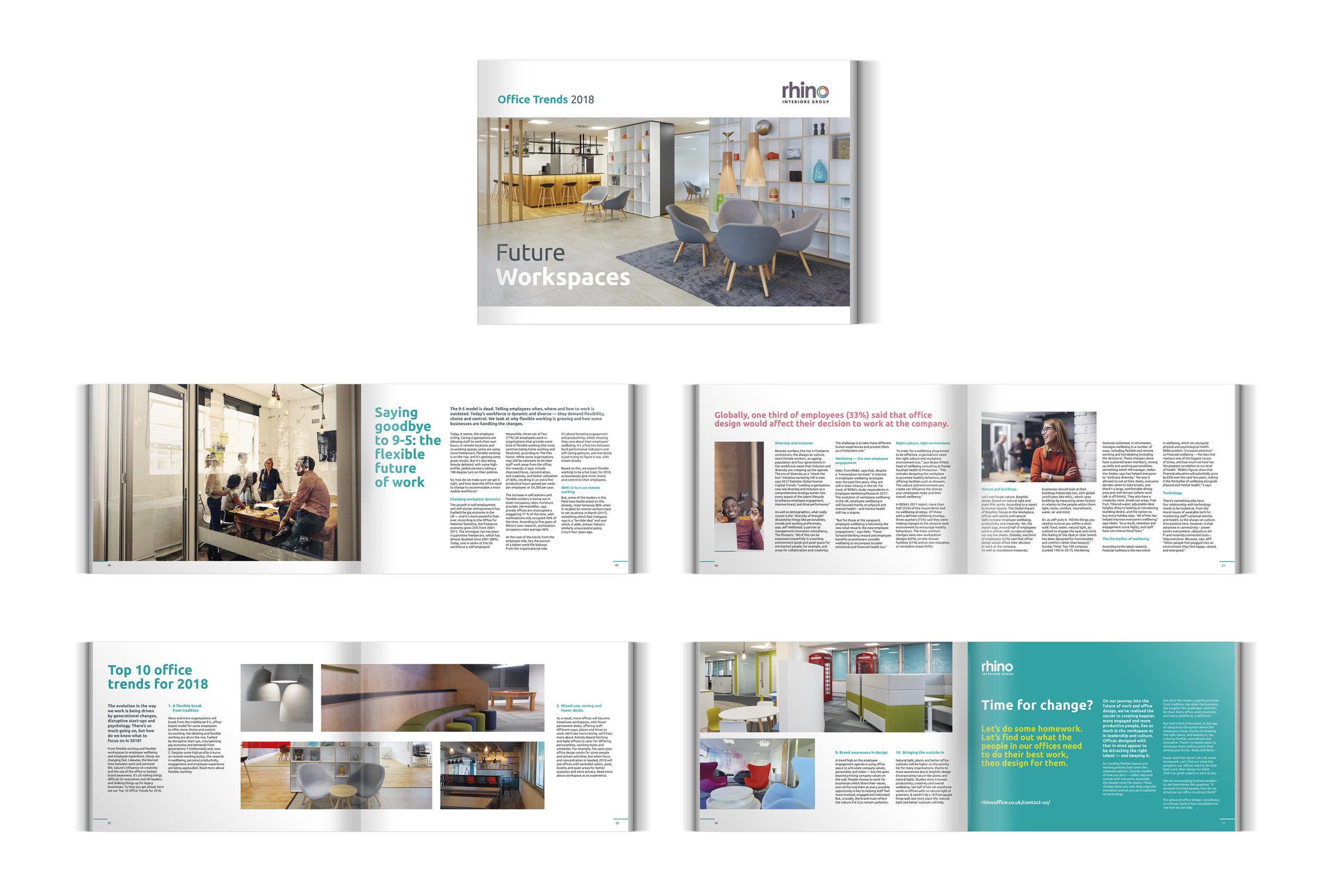
Rhino Interiors Group
Creative Direction and Design

I worked with an external marketing lead to create several reports for Rhino Interiors Group that covered various topics of the day. The organisation had some beautiful case study shots to utilise which I put to good use and with an overall sympathetic usage of clear space and punchy bold typography I found a style to push through the publications. The reports also featured carefully selected stock shots to capture the essence of the brands sophistication and to back-up the reports subject matter with secondary lifestyle styling, which allowed for some art direction.
These were nice projects to work on, as well as some of the other collateral I created including the launch event invite when they relocated to Birmingham.
Always happy to discuss something like this for you if you have a need. A really slick job can be achieved with some thought. Send me an email and let’s have a chat!


Justin Robert Price
creative. design. thinking.
Julia Gjertsen (Musician)
Creative Direction, Brand Identity/Strategy and Design

I worked on the creative and design of this identity with the talented Russian/Norwegian musician and composer Julia Gjertsen to define a brand identity to support her work and her website offering.
The logo roundel has some significance and meaning to the artist + it’s a monogram using the j + g of her name. With the modern typographical treatment the name mark and icon is crisp, clean and identifiable, even at small sizes and found peace as an icon.
I always believe in taking my logo work back to basics, it’s how all good identities should work imho. This was created as a mono device, incorporating black & white to reflect the keys on a piano, the main instrument she uses for the compositions she creates from her home studio in Oslo.
You can find her work on Spotify as well as from her label Moderna Records. Moderna have some truly awesome and special artists so well worth a listen and explore.


Justin Robert Price
creative. design. thinking.
Alpha4
Creative Direction, Brand Identity and Design

I created the brand identity and creative for Alpha4 who are a close-quarter security service. I really wanted something filled with meaning yet aesthetically minimal – like a good logo identity should be.
Due to the nature of their work I’m not at liberty to divulge a great deal about them, but if you read the rationale behind the identity below it will tell you that 4, not 3, is the magic number here.


Justin Robert Price
creative. design. thinking.
Coho
Creative Direction, Brand Identity/Strategy and Design

COHO and co:home are both brand identities I was recommended for and were created for this rather forward thinking tech start-up client. The team there are looking to create great software and links to guide their clients to effortless HMO management, that’s for both landlords and also tenants. Founder and CEO, Vann Vogstad was awarded Start-up Entrepreneur of the Year 2022 at the www.greatbritishentrepreneurawards.com, that’s no mean feat, and with other key members and experts is really shaping this offering.
I’m really rather proud of what we achieved with these two identities working together with Vann and the team all remotely, another client I’d worked with for several years and only met a few years ago after several projects and discussions. I know a few good designers had taken a shot at creating the brand offering for COHO so felt like a real win when both brand logos and styling projects went rather smoothly.


Also shown here – is the follow up brand look and feel for co:home – part of the COHO offering.


Justin Robert Price
creative. design. thinking.
Chantal Acda (Musician)
Creative Direction, Brand Identity and Design

Utilised for European tour promotion in late 2105 // 2016
I was introduced to the work of a Dutch musician (based in Belgium) called Chantal Acda in 2015. Her work really hit me hard, I just instantly felt a connection with it. Deep fascinating lyrics with such a beautiful voice... what's there not to like? A very talented lady and a credible musician who plays with real craft.
Many know I consume and utilise a great deal of music in my life, which guides my work at times. I believed I saw so much of the musician in the work I listened to and had a few ideas come to mind. I contacted her after being particularly inspired by a track she was releasing on a forthcoming album with a random logo idea I had. The process was really natural and within no time we'd nailed an identity together and one she really fell in love with. This sort of work is my favorite as you are working with another creative but from another field and I guess your only brief is what you feel from what you hear, read lyrically or where your own mind is at, in that time and place. It's all down to interpretation I guess, but enjoyable.
As well as the main logotype, this has also lead on to various projects such as imagery for marketing and promotion, creative for merchandise and also design and creative of her current tour poster used to promote shows in Belgium, Germany, Holland, France and Italy.
Her album from this time – is called The Sparkle In Our Flaws available via AppleMusic, Spotify (and at all good record stores).


Justin Robert Price
creative. design. thinking.
Go innovate – Aston University and Birmingham City University
Creative Direction, Campaign Concepts and Design

As well as working with Birmingham City University’s STEAMhouse offering creative and design for key marketing, I’ve also worked on other BCU marketing, advertising and communications collateral to promote initiatives. This is one that was a collaborative project between Birmingham City University and Aston Business School, and part sponsored by The European Union European Regional Development Fund called Go innovate!
I can’t take credit for the wonderful illustrations, these were from a previous project but the content we created certainly helped to highlight the initiative, plus a round-up report at the end of the period brought together data and findings in a unique way to help for future projects and learning.
I love and am passionate about ideas, I’m not just about the visual. I have lots of experience in guiding and shaping messaging as well as the creative and design to flow it through your marketing and communications. If this sounds like something you could benefit from then please contact me to find out more.


Justin Robert Price
creative. design. thinking.
Camping in the Forest
Creative Direction, Brand Development, Campaign Concepts and Design

After what started as a single A3 poster project… I then worked closely with Camping in the Forest (when under the ownership of The Camping and Caravanning Club) basically as a creative lead with a project lead that side, to help establish the design styling and tone for the brand for over two years as an external remote creative. This was after the organisation had been split from its original Forest Holidays Camping name, approx 2012.
I was supplied the new logo and a couple of existing colours and was given the task to shape the rest myself. I hand picked older assets, photography and imagery to sit with new messaging and styling working with the Marketing Manager that side on a daily basis (remotely) to create the correct visual and tone for what the organisation was, and aiming to achieve.
This really was a big project, we did everything from site maps, advertisements, 40 page brochures and even social media activity, ads and content. All to say as much as we could and to inform about the organisation and their beautiful campsites set in Forestry Commission land. Creating it was a true labor of love as was some of the other nature scenes – most of which you'd never be able to capture (Thank you Adobe Photoshop® and an active imagination).
It was very detailed and important I felt to include the beauty of Mother Nature, something I'd tried hard to establish through visual, copy and messaging on many of the forerunning projects. I wanted to celebrate nature which, capturing the simple pleasures life can hold in the fresh air of the great outdoors with the people you love, or in solitude.
*I believe Camping in the Forest is now operated by Forestry England Camping.


Justin Robert Price
creative. design. thinking.
Tulpa Digital
Creative Direction, Brand Identity/Strategy and Design

I created this brand identity for Demy and Tom at TULPA Digital a couple of years ago. It’s awesome when you understand the client, see their individuality and what they stand for. Even better… when you have a brand identity to create with a genuinely interesting meaning and back story.
So, the TULPA is a protector – for them I created a guardian angel. If you look to the centre of the device you’ll see it clearly, designed to work in negative space with arms high, wings outstretched, with halo and with the T and D hidden but it plain site. It felt great bringing this bit of good into the world and it stands for them in more ways than one.


Justin Robert Price
creative. design. thinking.
The Camping and Caravanning Club
Creative Direction, Campaign Concepts and Design

Shown is some of the creative projects I tackled for The Camping and Caravanning Club, which is a large membership organisation based in Coventry, England. 1 in 10 people in the UK are a member of the friendly club (that's huge). It was great to reach so many people with creative concepts to highlight and promote the benefits of the great outdoors.
As part of the various offerings, I supported many different marketing managers within the organisation with everything from new members campaigns, product, tourism and location guides through to advertising campaigns and everything in-between. This included communications to current members for products and services as well as specialist events and advertising for the club as a whole. Most of the projects were within the boundaries and styling of their then current identity but there have been many concepts and ideas I've helped to shape and assist with to promote their overall offering as a remote creative, especially with messaging and creative concepts.


Justin Robert Price
creative. design. thinking.
Hashi3
Creative Direction, Brand Identity/Strategy and Design

Shown here is my most recent brand creative project created for Hashi3 Ltd. in London. As with all identities simplicity should be key, however unique and relevant. I wanted to keep this professional, modern and innovative to match the client offering and expertise in their particular field.
Whilst working on the thinking and some of the strategic pull of the brand as part of developing this identity, I penned the tag line – For the journey ahead. After talking with the client during briefing I knew the aim of the organisation was to accelerate and supercharge the users business and personal growth with leadership at the very heart. The organisation can offer a wealth of experience along the road and that experience could confidently take you higher, further and be that guide and direction when you need it most.
Rationale behind the logo: Hashi is a Japanese word and it’s a polysemous – meaning it has several meanings, 3 to be exact. 3 is the magic number and it also balances with the 3 skill sets that set the client apart in their chosen field.
We rationalised these core offerings as: Bridging gaps / Managing pressure / And the delicate art of working with others.
The cross bar of the H acts as a bridge, this bridge then devides into 3 and this way highlights the 3 main skill sets as a small separate blocks, almost option to or choices, yet part of the main, whilst also clearly becoming the 3. When we can use a small icon such as this H3 to stand for Hashi3, we have something rather capable and usable at small sizes and usable in single colour. The colour set needed to reflect the sibling brand identity that I’d created a few months previous – which was Part of the .team which you can also see in the portfolio.
If you'd also like to work with me to enable your brand and your communications to resonate who / what and why? then please contact me and let's discuss.


Justin Robert Price
creative. design. thinking.
Transforming Cancer and End of Life Care (Staffordshire) – Macmillan and NHS
Creative Direction, Brand Identity and Design

I worked with a specialist project manager and a digital developer colleague (Simon Harper) on a project to promote the work of The Transforming Cancer and End of Life Care Programme – A pioneering project with The NHS and Macmillan working in partnership for cancer and end of life care in Staffordshire and Stoke-on-Trent.
The aim of the programme was to change the way the (then) current services were run and co-ordinated so that patients, their families and carers have a better experience of care. With this in mind we worked closely for several months with the aim of combining, myself getting the messaging, tone, visual and design where I believed it would be most effective and informative to the viewer and Simon doing the magic with regards it’s flow into digital and how that would work responsively. Some of the styling had to be carried over from a previous project (such as the logo), so we worked hard to balance the existing with the new we’d added to gracefully enhance and hopefully improve so the audience could take clean and clear insights.
We certainly learned a great deal during the process and it was good to have supported this worthy pioneering project for what are very important services.


Justin Robert Price
creative. design. thinking.
Sapio Research
Creative Direction, Campaign Concepts, Brand Development/Strategy and Design

SAPIO Research is another client and set of projects that started from a very small piece of creative… This one also was just a logo file supplied and from that a clean sheet of paper. From there I helped them build many things to spread the word of their services to strengthen the brand and to show what they can do.
Over the next 6 years I would work with the owners and the project leads to create many different reports, advertisements, marketing collateral, and coherent pieces of communication based on their research and data work for both SAPIO Research and also for their (other) larger international clients. Sadly I can’t show the many other projects we did together due to NDA agreements but here you will see many pieces that I shaped and styled, often in words and pixels to show what this great team could do.
Another important thing to add, I’ve only ever met the team in person once. That first time was some 4 years after our first project together. Proof again – when minds are on the task it doesn’t matter where you do it but how you do it.


Justin Robert Price
creative. design. thinking.
The Royal Society for the Prevention of Accidents
Creative Direction, Campaign Concepts and Design

Whilst supporting as Lead Creative at BigCat in Birmingham, I worked on many campaigns and projects for The Royal Society for the Prevention of Accidents (RoSPA) with creative, concepts and design on a large number of projects. This included everything from Ad concepts and event concepts, art direction and photoshoots through to printed brochures and literature/posters etc.
I also helped to shape the identity and messaging for their old HQ in Calthorpe Road in Birmingham. This included internal and external signage solutions and internal designs for prints, desks, seating and a timeline that flowed around the building highlighting key events in the organisations history. As they were moving to the new premises I penned the phrase 'The home of safety' which stuck with the organisation as a strap line for several years and appeared on their corporate brochure that year.


Justin Robert Price
creative. design. thinking.
Emmerson Press
Creative Direction, Campaign Concepts and Design

I’ve had the pleasure of both working with and for Emmerson Press for over 20 years. They’ve always been my print partner of choice as they are way ahead with their cutting edge print technology, knowledge about all things print and production and an incredible overall customer service. I really enjoy working with those where our standards align.
As part of this working relationship I’ve also been on the other side of that symbiosis and worked on a great deal of design and creative for them as an organisation, and I still do to this day, generating concepts to promote their full offering and capabilities, working with Director – John Emmerson. These projects are both on paper, as well as digital solutions. So, the usual advertising literature, brochures, mailers, postcards and fairly much everything in-between we’ve covered over the year so this work shown is a smattering of some of those concepts and end creative.
I highly recommend them as a company to get you the highest quality print. They’ve worked for some huge names and brands over the years but as founded as a family business some 40 years ago they have never lost the art of client relationship and that all important trust.


Justin Robert Price
creative. design. thinking.
Deadline Book Cover
Creative Direction, Concept and Design
I got initial contact from Geoff Major from a random Linkedin post in 2019. We had a great chat and he said he wanted to write a book, never done so before, but thought he had a great idea for a story. I was intrigued. His idea was that he wanted to have a cover design to help him realise the dream. An incentive if you like to keep him on track and to have a visual of getting over the line. He had to fit this around a busy work and family life but it was something he really wanted to achieve. So after he shared some inspiration of the particular pop-culture he enjoyed and liked I set out armed with the brief synopsis to bring that cover to life.
Now the book market is a highly competitive area. There truly are some stunning and impressive covers out there. Just look at any shelf in a book store and your eyes will be busy flitting from shelf to shelf drawn in by what could be.
This was an interesting one to let my mind go on (which can be a dangerous thing) I first started with the DEADLINE title, as the main character was from a journalism and newspaper background I created the poison pen letter style for the main title. It had that grungy, inky feel and felt perfect. I then added various associated press textures, stains, aging and marks and lay this on a traditional journalists notepad with recycle paper and think blue lines. Due to the nature of the book I wanted these thin blue lines to help to tell the story and with the serial killer connection they turned into an electrocardiogram – ECG and acted as a life-force indicator gently petering out as another victim is claimed. All in all it was enjoyable to add this level of detail, something the author really appreciated.
Geoff went on to finish that book and to get it published. It's had some great feedback and reviews and established himself as an author. What an achievement! He has since completed another book and has two more in the workings which I have also been involved in. I'll share these when I am safe to do so and they are completed. It was an honour to have been a small part of his journey.


Justin Robert Price
creative. design. thinking.
Kinetsu World Express
Creative Direction, Campaign Concept and Design

Shown, are a few creative concepts and end-design pieces created for Japanese global logistics provider, KWE – Kinetsu World Express who are a forwarding and aerospace logistics company operating in 46 countries, worldwide. This project was delivered for Kinetsu World Express (U.K) Ltd.
These projects were undertaken remotely and had quite a quick turnaround but I managed to get a nice end project for the client, which was fitting to their corporate style where it needed to be as well as having some individual personality and tone. I was happy I managed to crack a decent copy line for the advertisement and the visual was aesthetically pleasing and something that allowed the copy and imagery to work well together but with that all important clean space within the graphical treatment.

Justin Robert Price
creative. design. thinking.
Hello Digital
Creative Direction, Campaign Concepts and Design

In 2010 I worked with the team at BigCat Group in Birmingham as their Lead Creative and Senior Designer. One of the main projects I worked on was to create the styling, design and creative for the Hello Digital 2010 campaign that year. This was a large project run by Digital Birmingham and Birmingham City Council.
The Hello Digital festival was a week long event combining many workshops, events and key insights into the digital world promoting what Birmingham and the West Midlands region had to offer. Also the festival promoted a platform for discussion, gave insight and opinion from industry leaders, technology experts and visionaries on what was happening and was about to happen in the digital world.
The logotype for the event was already established from a previous event structure so my task was to combine that with a new look and feel for 2010. I developed the pixel styling as seemed appropriate given the subject matter. The possibilities for combinations and colour range were great. The familiar Birmingham skyline* shot was enhanced and integrated into the main poster campaign. This focused the activity and gave an iconic base – the city. Certainly caught the eye on PIP displays around town.
I created mood boards and concepts which I presented and talked through at client presentations then I worked with support from some of the design team to shape, tone and style so that there was synergy across all uses until the events completion, utilising, directing and working with other departments and colleagues to maintain consistency and keep the look on-brand.
This project included advertising, both via printed press, digital billboard and large format external applications as well as selected mailers and promotional event focused concepts and materials. It was an interesting project to work on and one that has prominence in my home town.
(credit: original Birmingham skyline raw shot by Daniel Sturley)


Justin Robert Price
creative. design. thinking.
Compare the build
Creative Direction, Brand Identity/Strategy and Design

I was contacted by compare the build's founder Joe Wilson in December 2022. Joe told me of his idea to become the UK’s 1st building material and D.I.Y comparison website and wanted me to work on the logo for this project, after a recommendation.
It's an interesting story... Joe was originally a Plasterer by trade with 20 years of experience. Compare the build was his personal mission to get fairer prices for everyday D.I.Y products as he found a large disparity in prices day-to-day with various stores and merchants. He understood this can make a project a no-go for many families, especially with lots having a tight budget. After research, he believed there was nothing currently online to compare these products and to offer consumers that much needed transparency, and ultimately that money saving tool the whole D.I.Y market and construction industry needed. Thus, Compare the build was born! Since that time he has established the website and it’s growing from strength to strength.
So, the nitty-gritty on the project specifics… After discussing and briefing I spent time doing a little research and then got to work on some base concepts in support of the brand creative. I wanted to establish a solid brand identity that was iconic and told the story, as with all identity projects I undertake. I knew this foundation would be very important to shape the visual identity as a whole. These assets for the brands identity – the logo, colours, choice of fonts could then be utilised by the client in all of the organisations other online and offline activities to raise awareness and position it in the market place. We hit a beat with some of the first options which was great and before long I’d adapted a few parts I wanted to improve further (after discussion) and mastered the base logo files (after sign-off) shortly after so the client had a kit to use right away.
Whilst working on the identity and having a look into the brand I wrote the tag line 'Like-for-like for less'. That’s the beauty of having learned more with regards to brand strategy, I look at brands in a way that makes them more complete and where I can add value to help tell it’s story authentically.
There's a detailed explanation and some rationale of how the main icon was formed and created below. Along with the tagline It really does explain the offering simply and effectively and felt very strong for the organisation and for the audience and marketplace.


Justin Robert Price
creative. design. thinking.
Birmingham Irish
Creative Direction and Design

I recently supported the Birmingham Irish Association for their 2024 St Patrick’s Day Parade promotion with creative and design for their digital OOH advert offering. The Ad featured on Ocean Outdoors Digital D6 network across the city, it’s a great network and service and the second time I’ve been on these screens with my work.
Due to the placement of these sort of Ads they tend to be a certain style. Impactful, short and sharp is the main aim. Spread out over 125 sites, you may have seen it if in the city before March 17th event, which was the first live event since covid and very well attended.
I was very proud to be asked to ad my skill set for what is a great cause supporting an Irish and wider community event in my home town, especially being a prestigious 50th year anniversary of this being organised as a parade in the second capital. With a diverse and changing city it’s important all get a chance to shine and to share their heritage and culture, and on Sunday there was plenty of green on show.
If I can support you in bringing your brand or project to a digital screen network like this then please contact me and let's discuss.

Justin Robert Price
creative. design. thinking.
Altimeter (Musicians)
Creative Direction, Brand Identity/Strategy and Design

This happens a lot… I saw or hear a band or musician… Liked what they do… Created something with an idea or piece of creative or design I thought worked well for the sound. And then I send it. Sometimes we strike up a conversation and sometimes we don’t. Just like the music, all interesting departures for the brain, and helps to test different styles and stops the dust settling.


Justin Robert Price
creative. design. thinking.